Tuesday, July 30, 2013

Mod 13 & 14 Video overload!!!!

1. For each video list/discuss the key concepts you learned.

A key concept learned from The Lowdown on Lowbrow video was that there was a classification of art called Lowbrow, I had never heard the term in relation to art pieces. 

The key concept I took from the Tate Modern is how you can mix genres and movements to use as a way to show the differences between the two and also to force the viewer to find a parallel.  I also found it interesting that they have combined genres as a way to force the viewer to experience all types of art not just those that they are familiar and comfortable with.

A key concept I took from Bones of Contention was that museums were now being asked to turn over the Indian remains so they could be buried by their native people.  I had no idea there was such a controversy.   

The key concept I learned from the video on Philippe de Montebello, Director of the Metropolitan Museum of Art was the process it takes to acquire pieces by large museums.   I also found the section on conservation to be extremely interesting.   If these pieces aren’t cared for properly their investment will be worthless.  Each material requires a different form of conservation and protection.               

2. Do the videos relate to the creation of your Art Exhibition project? If yes, explain how. If no, explain why not.

The Lowdown on Lowbrow did not relate or help in the creation of my exhibit, the imagery is so extremely different from the style or look I am going for.

Yes, the Tate Modern has inspired me to think outside the typical boxes of the theme I have chosen and see if there is a way to broaden the viewer’s understanding of my theme.

I do not feel this video related to my art exhibit project, there was no reference to creating an exhibit; only that there were archeological reserves of the Indian remains at the museums.  The only reference to an exhibit came at the very end when the Native Americans helped to create the exhibit after the repatriation was complete.

This video doesn’t exactly relate to our project but was close enough that I found it interesting to watch and gained a better understanding of just what goes into running a large museum.

3. What is your opinion of the films? Do they add depth to understanding of the art concepts you practiced while creating your curation project?

While I found this interesting in the struggle that these artists have had in being taken seriously, other than that, I didn’t find this useful in helping me create my exhibit. 

The Tate Modern was done very well; I learned a lot from this video and will use it to create my exhibit.  Yes this added a great deal of understanding of exhibiting and how you can intrigue the audience by forcing them out of there comfort level.

I felt the video on Indian bones was a waste of my time; I did not get a better understanding of creating an art exhibit. 

The video on the Met was great, I enjoyed seeing the career of Philippe de Montebello and seeing how he works with his different curators.  I also found it interesting to see some of the different pieces that have been shown in our text as examples, as they are displayed in the museum.  I don’t know whether this adds to my understanding that I will use to create my exhibit. 

Overall though, I found the time it took me to watch these videos, nearly four hours, is a lot of time and that time could have been better spent researching for pieces for my exhibit, putting together my interpretation of the pieces or working on the lay out of the PowerPoint slideshow. 

Sunday, July 28, 2013

Burchfield Penney Art Center Visit

My Visit to the Burchfield Penney Art Center of Buffalo, NY


Step 1: The Exhibition
Questions about the exhibit:

1. What is the title of the exhibit?

Marilyn
The Douglas Kirkland Photoshoot
2. What is the theme of the exhibition? 

The theme of this exhibition are photographs taken of Marilyn Monroe during a photoshoot she had with Douglas Kirkland.  One thing I loved about this exhibit was the fact that not only were the photos of Marilyn displayed they also displayed photos of Douglas Kirkland capturing the photoshoot. 


Step 2: The Gallery
Questions about the physical space:
1. What type of lighting is used?

The Burchfield Penney Art Center uses a mix of natural light, through the use of sky lights and the windows in the gallery, and artificial lighting. The artificial lighting is subtle not overwhelming or too bright.

2. What colors are used on the walls?

The majority of the walls in the gallery are white, there were also some black and grey walls.

3. What materials are used in the interior artchitecture of the space?

Materials that are used in the gallery are drywall for the walls, creating a soft space throughout. Wood and glass are used in some of the display cases. The wood is a light colored wood, possibly oak. The floors are also light wooden material.


4. How is the movement of the viewer through the gallery space?

The gallery has an open floor plan, this gently leads the viewer through the gallery and into the next space or exhibit. There is a pair of staircases, one in the foyer the other at the back endof the gallery, they are wide and open, which also gently guides you to the next level of the gallery.


(This pic was taken from the Burchfield website)


Step 3: The Artwork
Questions about the artwork:
1. How are the artworks organized?

The artworks are organized by exhibits within the different galleries in the building. Here is a link to the Burchfield Penney Layout

2. How are the artrworks similar?

I would say with the exception of two of the exhibits there was a muted color theme throughout the gallery, including the pieces of art displayed.  Many of the paintings had a monochromatic theme. The majority of color was seen in the Shasti O'Leary Soudant Let There Be Light Installation & Suspended Motion: Sculptures and Watercolor by Ellen Steinfeld. 


3. How are the artworks different?

The artworks are different in that they are from a variety of artists with varying styles, a variety of media and variety of sizes in the artworks.


4. How are the artworks framed?

The framed pieces vary from traditional decorative large wooden frames to a minimalist simple black frame.

5. How are the artworks identified and labeled?

The artworks are identified and labeled by using a vinyl label usually to the right of the piece. The black font is simple and unassuming.


6. What is the proximity of the artwork to each other?

The proximity of the artwork is relatively close to each other. The gallery maximizes its space while not appearing cluttered.


Step 4: Art Criticism Exercise


Artist: Douglas Kirkland
Title: Marilyn Monroe Photograph from his Photoshoot for Look Magazine's 25th anniversary cover
Media: Photograph
Date: 1961
Size: 40"x 60"

In this photograph, Marilyn is shot as she is peering over the side of the bed.  Shot in color, but the majority of the picture is muted tones of white, grey or silver. This photograph uses the emphasis element by displaying her face almost in the center and is the predominant feature of this photograph.  The use of a bed is a metaphor for her sex symbol status. I feel that photographer was intending to show Marilyn in a different way than she had ever been seen, innocent and shy but still loaded with sex appeal as was her trademark of the time.  By taking away the perfect hair, makeup and wardrobe we are able to get a glimpse into the soul of a beautiful icon.


Artist: Ben Perrone
Title: Illusion/Delusion
Media: black paper bags and monofilament
Date: 2009
Size: 252 x 252 x 252 inches

In this massive installation piece, we see black paper bags strung together by monofilament.  It is in the shape of an upside down pyramid.  This piece uses the elements and principals of space by its use of equal space between bags and its use of negative space between each bag, monochromatic color and asymmetrical balance.  The bags are meant to refer to a serviceman or woman whom has died in the Iraq War, body bags if you will.  Before I watched the video that is displayed to explain the meaning of the piece, I thought its meaning was that life is dwindling away each day.  When I saw that the artist meant this piece to be a protest of war I was truly moved.  I looked at the piece with all new respect and reverence.  To see all those bags as lives lost, very profound. 


Artist: Florence Julia Bach (1887-1979)
Title: The White Fan
Media: oil on canvas
Date: 1940
Size: 48 ¼ x 34 ¼ inches (Frame: 52 1/8 x 38 14 x 2 5/16 inches)

This is an oil painting with soft white tones of a woman, possibly on her wedding day. The main element I see displayed here is the optical effects of color, using the white and light blues add to the drama of the piece and the emphasis on the woman posing for this portrait. Scale and proportion is also used, the proportion of the woman is normal and the scale of the fan is large to emphasize the grandeur of the day.  I think the artist is portraying the woman as she is preparing for her wedding day, the look of apprehension and nervousness on her face is beautiful. 


Step 5: Document Your Visit

What did you think of visiting the Gallery and purposefully looking at the exhibition from a different perspective - the physical space, the architecture, theme, etc.?

I absolutely loved my visit at the Burchfield Penney Art Center, it was my first visit, but will certainly not be my last. I was so excited to see the Marilyn exhibit, I have always found her life intriguing and it was wonderful to see this side of her.  I also had a lot of fun in the Shasti O'Leary Soudant exhibit.  You are able to play with the art and that was quite fun, there was a large scale lite brite, an wall with bright colors that you could walk in front of and see your shadow, I took the opportunity to take this neat shot! 

I enjoyed walking through and taking note of how the gallery was laid out and what materials were used.  It made me a more receptive viewer. 

Another great part about my visit was that it was FREE!!  Admission is free for Buffalo State students and faculty. 

Saturday, July 27, 2013

Mod 12 Videos, Pop & Peace

I chose these two videos for this week's post:
Andy Warhol: Images of an Image
Isamu Noguchi: The Sculpture of Spaces

1. Explain why you selected each of the TWO videos you choose from the selection listed above.

I chose Andy Warhol: Images of an Image because I have found myself drawn to his work since my visit to the Albright Knox and see his work in their Pop Art Exhibit. I chose the Isamu Noguchi: The Sculpture of Spaces because the description of the video interested, it was different from any video I have watched thus far.

2. For each video list/discuss the key concepts you learned.

A key concept I took from the Warhol video was a better understanding of how he created his works of art and how he chose the images he was going to turn into his art. I also found the description of how the image is never the same when the screen printing is done as Warhol had done. His Ten Lizes is evidence of that, her image starts out nearly an exact copy of the original picture but as the image is duplicated it changes and finally the last image is much different from the original.

A key concept I learned was just how much goes into creating a garden or sculpture park on a large scale. I had no idea these took so many years to create. Another key concept was the way in which these parks create a sense peace and serenity for the community in which they are located. I loved the sections of the video that were silent and you could only hear the sounds of the water sculptures or the birds in the park, made me feel like I was there. Very peaceful experience.

3. How do the videos relate to the readings in the text?

The text goes into detail about Warhol in Ch. 22 but this video gave me more detailed understanding of how exactly he created his works. It was also to see his photo journalism pieces again, we saw those earlier this semester.

The Hoguchi video related to portion of the text in Ch 22 discussing Land Art.

4. What is your opinion of the films? How do they add depth to understanding of the readings and art concepts?

The Warhol video was done well, I would have liked it to have included more about his personal life. This video expanded my knowledge of printmaking and screen printing. 

The Hoguchi video was excellent, I loved the peaceful nature of the video and that the artist was featured so highly and was explaining his works in his own words. This video helped with my understanding of Land Art and sculpture, seeing these parks created helped me understand how some of the sculptures and land art examples may have come to be.


Best videos yet! Mod 11

The videos I chose for this week's blog were:
The Mystical North: Spanish Art
Matisse and Picasso

1. Explain why you selected each of the TWO videos you choose from the selection listed above.

My first selections, Dance at the Moulin de la Galette and A Sunday on La Grande Jatte, weren't working so I had to choose two other selections. I chose The Mystical North: Spanish Art from the 19th century to now because I was interested to learn more about the Spanish artists that are highlighted in this video. The second video I chose was Matisse and Picasso, I chose this because as I went through the remaining videos it most interested me. The videos on the masterworks of the western world were very dull and the narration was awful.

2. For each video list/discuss the key concepts you learned.

One key concept I learned from The Mystical North was the impact that the Spanish Civil War had on art of the period. This is evident in Picasso's Guernica, in which he depicts some of the horrors of the time. The bombing of a Spanish city by Francisco Franco. Picasso also portrays in this painting that he is holding out hope for his beloved country, that someday they will escape the tyranny of Franco. That day did come when Franco passed and his country was now liberated.

The key concept I took from the Matisse and Picasso was how important their relationship with each other was to their artistry. They may have had their squabbles and differences but in the end it added to their relationship and they were more family than they were artistic foes.

2. How do the videos relate to the readings in the text?

The Spanish Art video related to the discussion of surrealism, cubism and the expressionist movement that was outlined in ch 21. I also gained a greater knowledge of many of the pieces that have been used in previous chapters as well as the current chapters for this module. In particular Goya, this section contained much more detail than the text allowed.

The Matisse and Picasso video relates to the text in its offering of a more detailed telling of their lives. The text briefly describes both. It also adds to my understanding of the movement to modern art and how that developed.

3. What is your opinion of the films? How do they add depth to understanding of the readings and art concepts?

I found the Spanish Art video quite interesting, I most enjoyed the interviews with the woman whom is living in the building designed by Gaudi and the interview with the man who survived the bombing in Belchite. This gave me a greater understanding of what life is like in Spain and helped me relate to the Spanish art more closely. I also found the passionate narration by the host added to the video as well. His descriptions were full of life and enthusiasm. 

The Matisse and Picasso video was intriguing and informative. I loved the inclusion of their wives and children and how they added to the artwork that each artist was creating at that time.

Both videos helped me to better understand the concepts of Expressionism, Cubism, Fauvism and added to my understanding of how art is created. I found these videos to be not only the most entertaining but I also learned the most from watching them.


Tuesday, July 23, 2013

Module Ten- Art Making/Material Exploration Blog: Mask Making

Creating my mask: Step 1 my inspirations!!


Fancy Coconut Mask of Puerto Rico

Media: painted coconut husk and carved wood spikes
Artist : unknown
Date: unknown

Description: Brightly painted coconut husk, Eleven skinny long spikes arranged around the face of the mask.
Formal Analysis:  This piece uses the element of pattern, the pattern is not only on the face but is carried through to the spikes.


Blue Moon Mask

Media: carved and painted wood
Artist: Unknown
Date: Unknown
Size: 8 inches

Description: This brightly painted mask from Mexico uses vivid colors, predominately the blue to indicate a night sky full of stars.
Formal Analysis: This mask uses color as its main element of art and also utilizes texture in the carving on the wood.  Another element used was that of stippling, this creates the effect of stars.


Columbian Mask

Media: Carved and painted wood
Artist: unknown
Date: unknown
Size: 9 inches

Description: Carved and then painted wooden mask, bright colors used, two small holes used as eye holes.
Formal Analysis: Texture is added to the top of the mask to create the look of hair.  The variety of pattern and color are elements used. 

In looking up different masks I found this picture and that's where I have come up with the idea to use a milk carton as the base for my mask. 


Here are the sketches I came up with for my mask:


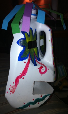
Here is my completed mask:


The elements of design I used are color, I used a contrasting color scheme, line, the lines on the nose and at the bottom of the mask create movement.  I also used strips of paper at the top to create texture to the mask and also serves as hair. 
 
I'm quite happy with how my mask turned out. Using a gallon milk jug helped me to create the three dimensional quality for this mask. I found the process of research to be the hardest part of this process but also helpful. Had I not come across the picture of the milk jug I would have had a much harder time creating a three dimensional mask. I can't wait to see what my classmates did for their own masks. 


Mod 10 Videos Blog

I chose these two videos as my selections:
African Art: A Legacy of Oppression
The Great Wave


1. Explain why you selected each of the TWO videos you choose from the selection listed above.

I selected the African Art: A legacy of Oppression because the title intrigued me as well as the description of the video.  I chose The Great Wave because I have admired this painting and was interested in learning more about its background

2. For each video list/discuss the key concepts you learned.

A key concept I learned from the African Art video was that much of the art we see as western art has roots in African Art, in particular the minimalist abstract. Another key concept was how terribly the African people were treated and then even displayed as art to "enrich" the western society about the African people and lands. 

A key concept I learned from The Great Wave video was the making of a print.  I didn't realize that you needed to make a separate woodblock relief for each color that will be in the print.  I found this portion of the video most informative.  What a tedious process this is. 


3. How do the videos relate to the readings in the text?

The African art video relates to the African art section of the text in chapter 18 and helped me to understand the ideals behind their art.

The Great Wave video related to the previous chapter on prints and in chapter 19's description of Japanese art. 

4. What is your opinion of the films? How do they add depth to understanding of the readings and art concepts?

I felt the African video was done very well, full of information and was only 21 minutes long.  This video helped me to gain a better knowledge as to how the art came to the western world, as horrifying as it is to think about. 

The Great Wave was an interesting video and helped me to better grasp the concepts of prints and editions of prints. 

Mod 9 Videos Blog

For this week's module I chose the below videos:
Leonardo da Vinci: The Mind of the Renaissance
Velazquez

1. Explain why you selected each of the TWO videos you choose from the selection listed above.

I selected these two videos based on the descriptions of the videos on the link and because I was interested in learning more about Leonardo da Vinci. I chose the video about Velazquez because I was unfamiliar with his work.

2. For each video list/discuss the key concepts you learned.

The key concept I learned from the Leonardo da Vinci was just how vast his talents were. Not only as an artist but as a scientist, an architect, and engineer. He was an innovator almost from childbirth.  As a young child he was always trying to learn more and even started inventing new ways to do everyday activities like reading. He became so talented that his mentor Veraccio stopped creating art after seeing da Vinci develop. 

The key concept I learned from the Velazquez video was how he was able to balance the humanity of the figures while still depicting them as a "jester" or a character.  He did this skillfully through his use of color, the use of subtle and bold together and also in the way in which he painted their faces as distorted and lacking light suggesting that they were dim witted. 

2. How do the videos relate to the readings in the text?

Both videos expand the knowledge of each artist.  The text does talk about and showcase each of these two artists but the videos give you a more detailed understanding of each artists life. 

3. What is your opinion of the films? How do they add depth to understanding of the readings and art concepts?

I found both films interesting, particularly the video on da Vinci; I found his life fascinating.  The description of his use of hatching gave me a better understanding of that art concept, it was helpful to see the drawing as the description was explained.  In the Velazquez video I found the description on his use of simple coloring as opposed to rich and vibrant colors to get his point across helpful in better understanding of the use of colors.