1. What were your expectations for this course and where they met?
My expectations for the course were to gain a better knowledge of Art in general and in terms of its place in today's ever changing world. I do feel that these were met and then some, I have learned so much more this semester than I had ever anticipated.
2. Now that you've been through this course, What is art? How would you define it now compared to your initial posting?
I would say that my initial posting about what art is, was good, I would now add that even a novice can create art, art is something that enriches your life.
3. Who was your favorite artist in your original posting and who is your favorite visual artist now? If there is a difference, why do you think so? If you have the same favorite artist, why do you think so?
My new favorite visual artist is now Ghada Amer, I have found myself almost to the point of obsession with her work. I would love to see one of her works of art in person, to see for myself her technique of painting and embroidery. This course has opened my eyes to modern works of art, previous to this course, I barely gave them a second glance, now I'm completely fascinated.
4. Now that you've completed this course, how do you feel about taking an online course? Is your answer the same as it was in your first posting? How is it the same or different?
My answer is the same, I am completely comfortable taking an online course but I do still prefer a classroom.
Thursday, August 8, 2013
Art Criticism Reflection Blog
1. Which projects did you review?
I reviewed all the exhibits and narrowed it down to three and from the three I made my selection. The three I narrowed it down to were Nature of the World by Brian Kubik, Nautical Artistry by Danielle Jarosz, and The Visions Through Faith by Carl Desir
2. Why did you select the Exhibit you critiqued?
I selected Nautical Artistry by Danielle Jarosz for my critique article because I thought her theme choice was intriguing and I also felt her choices are art fit her theme and offered a good variety to her exhibit.
3. What challenges did you face in writing the critique article and how did you overcome them?
I had a difficult time deciding how I was going to word my critique and what I would be critiquing. Should I be critiquing whether or not my peer adhered to the specifications of the project or just the exhibit itself, ultimately I decided to just critique the exhibit as a whole and not to get into the minutia of the project specifications. As for the wording, I read a few exhibit reviews online to help me.
4. How do you feel about critiquing your peers work?
I was at first uncomfortable with the idea, but once I got into the writing of the criticism, I enjoyed it and am happy with my end result.
5. Would you like to read the critique your peers wrote about your Art Curation Project?
Yes, I would be very interested to read any critques from my peers about my own Art Curation Project. I put so much time and effort into that project that I would love to know what others thought and whether they enjoyed my exhibit. I would also find it helpful to know what people may no have liked about it.
6. On a scale of 1-10 how would you rate your finished article and why?
I would rate my article a 9, I felt it covered all the aspects of the exhibit and offered my own insight into the exhibit.
7. Did you enjoy working on this project?
Yes I did enjoy this project. Fun assignment.
Tuesday, August 6, 2013
Mod 15 - Final Video Review Blog
The videos I selected this week are:
Jackson Pollock: Michael Fried and T. J. Clark in Conversation
An Introduction to the Italian Renaissance (Giorgio Vasari)
Step 2: Questions for your Blog Posting
1. For each video list/discuss the key concepts you learned.
The key concept I took from the Pollock criticism by Fried and TJ Clark was that while people may have differing viewpoints, they can be respectful of each other's opinions and learn from them. I found their differing viewpoints gave me a greater understanding of the piece.
The key concept I took from the Italian Renaissance video was the connection the artists had with one another and the influence each had on the next. It also gave me a refresher on art vocabulary.
2. Do the videos relate to the creation of your Art Criticism project? If yes, explain how. If no, explain why not.
I feel they both relate to the art criticism project. The Pollock video, helped me to understand that while I may disagree with something I see in someone's exhibit piece, I must still be respectful and tactful. The Vasari video relates in its descriptions of pieces and how even though initially we may not think something relates to the project, I may need to take another look and reevaluate.
3. What is your opinion of the films? Do they add depth to understanding of art criticism?
I enjoyed both videos but felt the Vasari video was geared towards a younger audience. Yes I feel they both added depth to my understanding of art criticism.
Monday, August 5, 2013
Art Gallery Visit #3: Self-Portraits Art Making/Material Exploration Blog
In this Art Making/Material Exploration project we have been asked to visit an art gallery, either in person or digitally, to study self portraiture and then use this information to create our own self portrait. I opted to visit an art gallery using Google Art Project. Below are the three pieces I have used in part for my inspiration.

Self-Portrait with Striped Shirt, Egon Schiele | Leopold Museum, Vienna, 1910, 305x443cm, http://www.google.com/culturalinstitute/asset-viewer/self-portrait-with-striped-shirt/IgEZ5y6LafINFA?hl=en&projectId=art-project

Marxism Will Give Health to the Ill, Frida Kahlo, Museo Frida Kahlo, 1954, 600x760mm, http://www.google.com/culturalinstitute/asset-viewer/marxism-will-give-health-to-the-ill/HAElPPnYYlxEWA?hl=en&projectId=art-project

Autorretrato escondido en mi miedo (Self hiding in my fear), Alberto García-Alix, Fundacion MAPFRE, 2009, 47x47cm http://www.google.com/culturalinstitute/asset-viewer/autorretrato-escondido-en-mi-miedo/KgGw8isvzH2dEw?hl=en&projectId=art-project
Here is the photograph of myself that I used to create my self portrait, it was taken on my recent vacation:


1. Why did you select the inspiration pieces? I selected these pieces for their abstract qualities. I knew I wanted my finished piece to be more abstract than a conventional self portrait.
2. Why did you select the media to create your self-portrait? I am most familiar with photography and editing, so I chose a media I would be comfortable using. I am not a fan of taking my picture or seeing pictures of myself, so I wanted to be as comfortable in the creation process as possible. To create the final product, I edited the photo several times. First, I adjusted the exposure as photographing in the sun can sometimes over expose your shot. Second I adjusted the contrast so the colors wold stand out from one another. Then I ran the photo through a filter turning the pixels into tiny brush strokes resembling pointillism. Finally, I softened the colors to make the photo look like a painting.
3. What challenges did you face in creating your self-portrait and how did you overcome them? The biggest challenge I faced was myself and my own self esteem issues. To overcome this, I had to focus on the creation itself and not on nit picking every aspect of my face. Another challenge was the editing process, its a long and tedious process that takes a lot of patience.
4. How does this piece represent you? The final piece represents my struggles, and how I am trying to put back the pieces after a difficult two years.
5. What elements and principles of art did you apply in this work? I created direction and movement in the use of pixels and color contrast. I also used asymmetrical balance in order to convey the feeling of life being up in the air and not in perfect balance.
6. Did you enjoy working on this project? Yes, now that it is complete, I can look back and admire the work I created, that helps make up for the challenges I had during the creation portion of this process.
7. What do you think of your final artwork? I am very proud of my finished work, so much so, I have sent it to be printed and I plan on displaying it in my apartment. I will look as this as inspiration going forward, I can overcome and I will succeed.

Self-Portrait with Striped Shirt, Egon Schiele | Leopold Museum, Vienna, 1910, 305x443cm, http://www.google.com/culturalinstitute/asset-viewer/self-portrait-with-striped-shirt/IgEZ5y6LafINFA?hl=en&projectId=art-project

Marxism Will Give Health to the Ill, Frida Kahlo, Museo Frida Kahlo, 1954, 600x760mm, http://www.google.com/culturalinstitute/asset-viewer/marxism-will-give-health-to-the-ill/HAElPPnYYlxEWA?hl=en&projectId=art-project

Autorretrato escondido en mi miedo (Self hiding in my fear), Alberto García-Alix, Fundacion MAPFRE, 2009, 47x47cm http://www.google.com/culturalinstitute/asset-viewer/autorretrato-escondido-en-mi-miedo/KgGw8isvzH2dEw?hl=en&projectId=art-project
Here is the photograph of myself that I used to create my self portrait, it was taken on my recent vacation:

I took my photo and with the use of editing software created the below image, my completed self portrait.

1. Why did you select the inspiration pieces? I selected these pieces for their abstract qualities. I knew I wanted my finished piece to be more abstract than a conventional self portrait.
2. Why did you select the media to create your self-portrait? I am most familiar with photography and editing, so I chose a media I would be comfortable using. I am not a fan of taking my picture or seeing pictures of myself, so I wanted to be as comfortable in the creation process as possible. To create the final product, I edited the photo several times. First, I adjusted the exposure as photographing in the sun can sometimes over expose your shot. Second I adjusted the contrast so the colors wold stand out from one another. Then I ran the photo through a filter turning the pixels into tiny brush strokes resembling pointillism. Finally, I softened the colors to make the photo look like a painting.
3. What challenges did you face in creating your self-portrait and how did you overcome them? The biggest challenge I faced was myself and my own self esteem issues. To overcome this, I had to focus on the creation itself and not on nit picking every aspect of my face. Another challenge was the editing process, its a long and tedious process that takes a lot of patience.
4. How does this piece represent you? The final piece represents my struggles, and how I am trying to put back the pieces after a difficult two years.
5. What elements and principles of art did you apply in this work? I created direction and movement in the use of pixels and color contrast. I also used asymmetrical balance in order to convey the feeling of life being up in the air and not in perfect balance.
6. Did you enjoy working on this project? Yes, now that it is complete, I can look back and admire the work I created, that helps make up for the challenges I had during the creation portion of this process.
7. What do you think of your final artwork? I am very proud of my finished work, so much so, I have sent it to be printed and I plan on displaying it in my apartment. I will look as this as inspiration going forward, I can overcome and I will succeed.
Sunday, August 4, 2013
Reflecting back on Project 4
This project was quite the challenge, I'm glad that I took my time with it these last couple weeks rather than just cramming it together at the last minute. I would be so stressed right now if I had a lot left to finished. There was so much that went into creating this art exhibit. Coming up with a theme is probably what took me the longest. I was going between several and kept coming up short. Initially I wanted to do an exhibit that featured analogous works of art, colors from the same side of the color wheel. That was difficult to search for works of art though and I would have spent way too much time finding works of art. Then I wanted to do a theme on a particular emotion, but I again was having trouble searching that topic. Then I decided to look at pieces of art that I have personally loved and find a theme based on one of those. Bam, that was it. Once I pulled up Sunday Afternoon on the Island of La Grande Jatte by Georges Seurat, I knew my theme would be pointillism.
Another challenge I had was accessing ArtStor, I tried everything. Even watched a video on registering but couldn't get the screen where you register to pop up, only a log in screen. I sent an email to ArtStor directly and they explained that for registering I had to be on the Buffalo State proxy and that could be done through the Butler Library website. Once I did that, it worked and I was able to register and then use the website. Its so user friendly and made my searching for pieces so much easier. ArtStor is where I found the majority of my artworks.
Creating the PowerPoint layout was pretty simple for me, its a program I'm familiar with and comfortable using. I wanted to use a simple theme as my layout theme, similar to the design elements used in an art gallery. I didn't want to take away or distract from the works of art I was using. I also chose a simple color scheme, fonts and page layouts. I wanted to create continuity and flow from one slide to the next. I opted not to use transitions or animations, as I felt they would also be distracting for the viewer. The citations for the artwork are in the notes section of each slide.
I organized my pieces into the following sections:
Writing the interpretations of each piece was difficult but by using the Art Criticism steps from the previous assignments, I was able to come up with informed interpretations. I did second guess myself quite a bit and spent more time than I had anticipated on it.
Overall, I'm very proud of my end result and I hope everyone enjoys it and appreciates the hard work and time I put into this project. I'm also interested to see how everyone else's exhibits turned out.
Another challenge I had was accessing ArtStor, I tried everything. Even watched a video on registering but couldn't get the screen where you register to pop up, only a log in screen. I sent an email to ArtStor directly and they explained that for registering I had to be on the Buffalo State proxy and that could be done through the Butler Library website. Once I did that, it worked and I was able to register and then use the website. Its so user friendly and made my searching for pieces so much easier. ArtStor is where I found the majority of my artworks.
Creating the PowerPoint layout was pretty simple for me, its a program I'm familiar with and comfortable using. I wanted to use a simple theme as my layout theme, similar to the design elements used in an art gallery. I didn't want to take away or distract from the works of art I was using. I also chose a simple color scheme, fonts and page layouts. I wanted to create continuity and flow from one slide to the next. I opted not to use transitions or animations, as I felt they would also be distracting for the viewer. The citations for the artwork are in the notes section of each slide.
I organized my pieces into the following sections:
- Inspiration
- Pointillist Everyday Life
- Seasonally Pointed
- Points on the Waterfront
- Pointillism of the Sea
- Poignant Portraiture
- Modern Points
Writing the interpretations of each piece was difficult but by using the Art Criticism steps from the previous assignments, I was able to come up with informed interpretations. I did second guess myself quite a bit and spent more time than I had anticipated on it.
Overall, I'm very proud of my end result and I hope everyone enjoys it and appreciates the hard work and time I put into this project. I'm also interested to see how everyone else's exhibits turned out.
Tuesday, July 30, 2013
Mod 13 & 14 Video overload!!!!
1. For each video list/discuss the key concepts you learned.
A key concept learned from The Lowdown on Lowbrow video was
that there was a classification of art called Lowbrow, I had never heard the
term in relation to art pieces.
The key concept I took from the Tate Modern is how you can
mix genres and movements to use as a way to show the differences between the
two and also to force the viewer to find a parallel. I also found it interesting that they have
combined genres as a way to force the viewer to experience all types of art not
just those that they are familiar and comfortable with.
A key concept I took from Bones of Contention was that museums
were now being asked to turn over the Indian remains so they could be buried by
their native people. I had no idea there
was such a controversy.
The key concept I learned from the video on Philippe de Montebello, Director of
the Metropolitan Museum of Art was the process it takes to acquire pieces by
large museums. I also found the section on conservation to be
extremely interesting. If these pieces aren’t cared for properly
their investment will be worthless. Each
material requires a different form of conservation and protection.
2. Do the videos relate to the creation of your Art
Exhibition project? If yes, explain how. If no, explain why not.
The Lowdown on Lowbrow did not relate or help in the
creation of my exhibit, the imagery is so extremely different from the style or
look I am going for.
Yes, the Tate Modern has inspired me to think outside the
typical boxes of the theme I have chosen and see if there is a way to broaden
the viewer’s understanding of my theme.
I do not feel this video related to my art exhibit project,
there was no reference to creating an exhibit; only that there were
archeological reserves of the Indian remains at the museums. The only reference to an exhibit came at the
very end when the Native Americans helped to create the exhibit after the repatriation
was complete.
This video doesn’t exactly relate to our project but was
close enough that I found it interesting to watch and gained a better
understanding of just what goes into running a large museum.
3. What is your opinion of the films? Do they add depth to
understanding of the art concepts you practiced while creating your curation
project?
While I found this interesting in the struggle that these
artists have had in being taken seriously, other than that, I didn’t find this
useful in helping me create my exhibit.
The Tate Modern was done very well; I learned a lot from
this video and will use it to create my exhibit. Yes this added a great deal of understanding
of exhibiting and how you can intrigue the audience by forcing them out of
there comfort level.
I felt the video on Indian bones was a waste of my time; I
did not get a better understanding of creating an art exhibit.
The video on the Met was great, I enjoyed seeing the career
of Philippe de
Montebello and seeing how he works with his different curators. I also found it interesting to see some of the
different pieces that have been shown in our text as examples, as they are
displayed in the museum. I don’t know
whether this adds to my understanding that I will use to create my
exhibit.
Overall though, I found the time it took me to
watch these videos, nearly four hours, is a lot of time and that time could have been better spent researching for pieces for my exhibit,
putting together my interpretation of the pieces or working on the lay out of
the PowerPoint slideshow.
Sunday, July 28, 2013
Burchfield Penney Art Center Visit
My Visit to the Burchfield Penney Art Center of Buffalo, NY

Step 1: The Exhibition
Questions about the exhibit:

Marilyn
The Douglas Kirkland Photoshoot

The theme of this exhibition are photographs taken of Marilyn Monroe during a photoshoot she had with Douglas Kirkland. One thing I loved about this exhibit was the fact that not only were the photos of Marilyn displayed they also displayed photos of Douglas Kirkland capturing the photoshoot.
Step 2: The Gallery
Questions about the physical space:
1. What type of lighting is used?
The Burchfield Penney Art Center uses a mix of natural light, through the use of sky lights and the windows in the gallery, and artificial lighting. The artificial lighting is subtle not overwhelming or too bright.
2. What colors are used on the walls?
The majority of the walls in the gallery are white, there were also some black and grey walls.
3. What materials are used in the interior artchitecture of the space?
Materials that are used in the gallery are drywall for the walls, creating a soft space throughout. Wood and glass are used in some of the display cases. The wood is a light colored wood, possibly oak. The floors are also light wooden material.
 4. How is the movement of the viewer through the gallery space?
 The gallery has an open floor plan, this gently leads the viewer through the gallery and into the next space or exhibit. There is a pair of staircases, one in the foyer the other at the back endof the gallery, they are wide and open, which also gently guides you to the next level of the gallery.

(This pic was taken from the Burchfield website)
Step 3: The Artwork
Questions about the artwork:
1. How are the artworks organized?
The artworks are organized by exhibits within the different galleries in the building. Here is a link to the Burchfield Penney Layout
2. How are the artrworks similar?
I would say with the exception of two of the exhibits there was a muted color theme throughout the gallery, including the pieces of art displayed. Many of the paintings had a monochromatic theme. The majority of color was seen in the Shasti O'Leary Soudant Let There Be Light Installation & Suspended Motion: Sculptures and Watercolor by Ellen Steinfeld.
3. How are the artworks different?
The artworks are different in that they are from a variety of artists with varying styles, a variety of media and variety of sizes in the artworks.
4. How are the artworks framed?
The framed pieces vary from traditional decorative large wooden frames to a minimalist simple black frame.
5. How are the artworks identified and labeled?
The artworks are identified and labeled by using a vinyl label usually to the right of the piece. The black font is simple and unassuming.
 6. What is the proximity of the artwork to each other?
The proximity of the artwork is relatively close to each other. The gallery maximizes its space while not appearing cluttered.
Step 4: Art Criticism Exercise

Title: Marilyn Monroe Photograph from his Photoshoot for Look Magazine's 25th anniversary cover
Media: Photograph
Date: 1961
Size: 40"x 60"
In this photograph, Marilyn is shot as she is peering over the side of the bed. Shot in color, but the majority of the picture is muted tones of white, grey or silver. This photograph uses the emphasis element by displaying her face almost in the center and is the predominant feature of this photograph. The use of a bed is a metaphor for her sex symbol status. I feel that photographer was intending to show Marilyn in a different way than she had ever been seen, innocent and shy but still loaded with sex appeal as was her trademark of the time. By taking away the perfect hair, makeup and wardrobe we are able to get a glimpse into the soul of a beautiful icon.

Artist: Ben Perrone
Title: Illusion/Delusion
Media: black paper bags and monofilament
Date: 2009
Size: 252 x 252 x 252 inches
In this massive installation piece, we see black paper bags strung together by monofilament. It is in the shape of an upside down pyramid. This piece uses the elements and principals of space by its use of equal space between bags and its use of negative space between each bag, monochromatic color and asymmetrical balance. The bags are meant to refer to a serviceman or woman whom has died in the Iraq War, body bags if you will. Before I watched the video that is displayed to explain the meaning of the piece, I thought its meaning was that life is dwindling away each day. When I saw that the artist meant this piece to be a protest of war I was truly moved. I looked at the piece with all new respect and reverence. To see all those bags as lives lost, very profound.

Title: The White Fan
Media: oil on canvas
Date: 1940
Size: 48 ¼ x 34 ¼ inches (Frame: 52 1/8 x 38 14 x 2 5/16 inches)
This is an oil painting with soft white tones of a woman, possibly on her wedding day. The main element I see displayed here is the optical effects of color, using the white and light blues add to the drama of the piece and the emphasis on the woman posing for this portrait. Scale and proportion is also used, the proportion of the woman is normal and the scale of the fan is large to emphasize the grandeur of the day. I think the artist is portraying the woman as she is preparing for her wedding day, the look of apprehension and nervousness on her face is beautiful.
Step 5: Document Your Visit
What did you think of visiting the Gallery and purposefully looking at the exhibition from a different perspective - the physical space, the architecture, theme, etc.?
I absolutely loved my visit at the Burchfield Penney Art Center, it was my first visit, but will certainly not be my last. I was so excited to see the Marilyn exhibit, I have always found her life intriguing and it was wonderful to see this side of her. I also had a lot of fun in the Shasti O'Leary Soudant exhibit. You are able to play with the art and that was quite fun, there was a large scale lite brite, an wall with bright colors that you could walk in front of and see your shadow, I took the opportunity to take this neat shot!

Another great part about my visit was that it was FREE!! Admission is free for Buffalo State students and faculty.
Saturday, July 27, 2013
Mod 12 Videos, Pop & Peace
I chose these two videos for this week's post:
Andy Warhol: Images of an Image
Isamu Noguchi: The Sculpture of Spaces
1. Explain why you selected each of the TWO videos you choose from the selection listed above.
I chose Andy Warhol: Images of an Image because I have found myself drawn to his work since my visit to the Albright Knox and see his work in their Pop Art Exhibit. I chose the Isamu Noguchi: The Sculpture of Spaces because the description of the video interested, it was different from any video I have watched thus far.
2. For each video list/discuss the key concepts you learned.
A key concept I took from the Warhol video was a better understanding of how he created his works of art and how he chose the images he was going to turn into his art. I also found the description of how the image is never the same when the screen printing is done as Warhol had done. His Ten Lizes is evidence of that, her image starts out nearly an exact copy of the original picture but as the image is duplicated it changes and finally the last image is much different from the original.
A key concept I learned was just how much goes into creating a garden or sculpture park on a large scale. I had no idea these took so many years to create. Another key concept was the way in which these parks create a sense peace and serenity for the community in which they are located. I loved the sections of the video that were silent and you could only hear the sounds of the water sculptures or the birds in the park, made me feel like I was there. Very peaceful experience.
3. How do the videos relate to the readings in the text?
The text goes into detail about Warhol in Ch. 22 but this video gave me more detailed understanding of how exactly he created his works. It was also to see his photo journalism pieces again, we saw those earlier this semester.
The Hoguchi video related to portion of the text in Ch 22 discussing Land Art.
4. What is your opinion of the films? How do they add depth to understanding of the readings and art concepts?
The Warhol video was done well, I would have liked it to have included more about his personal life. This video expanded my knowledge of printmaking and screen printing.
The Hoguchi video was excellent, I loved the peaceful nature of the video and that the artist was featured so highly and was explaining his works in his own words. This video helped with my understanding of Land Art and sculpture, seeing these parks created helped me understand how some of the sculptures and land art examples may have come to be.
Best videos yet! Mod 11
The videos I chose for this week's blog were:
The Mystical North: Spanish Art
Matisse and Picasso
1. Explain why you selected each of the TWO videos you choose from the selection listed above.
My first selections, Dance at the Moulin de la Galette and A Sunday on La Grande Jatte, weren't working so I had to choose two other selections. I chose The Mystical North: Spanish Art from the 19th century to now because I was interested to learn more about the Spanish artists that are highlighted in this video. The second video I chose was Matisse and Picasso, I chose this because as I went through the remaining videos it most interested me. The videos on the masterworks of the western world were very dull and the narration was awful.
2. For each video list/discuss the key concepts you learned.
One key concept I learned from The Mystical North was the impact that the Spanish Civil War had on art of the period. This is evident in Picasso's Guernica, in which he depicts some of the horrors of the time. The bombing of a Spanish city by Francisco Franco. Picasso also portrays in this painting that he is holding out hope for his beloved country, that someday they will escape the tyranny of Franco. That day did come when Franco passed and his country was now liberated.
The key concept I took from the Matisse and Picasso was how important their relationship with each other was to their artistry. They may have had their squabbles and differences but in the end it added to their relationship and they were more family than they were artistic foes.
2. How do the videos relate to the readings in the text?
The Spanish Art video related to the discussion of surrealism, cubism and the expressionist movement that was outlined in ch 21. I also gained a greater knowledge of many of the pieces that have been used in previous chapters as well as the current chapters for this module. In particular Goya, this section contained much more detail than the text allowed.
The Matisse and Picasso video relates to the text in its offering of a more detailed telling of their lives. The text briefly describes both. It also adds to my understanding of the movement to modern art and how that developed.
3. What is your opinion of the films? How do they add depth to understanding of the readings and art concepts?
I found the Spanish Art video quite interesting, I most enjoyed the interviews with the woman whom is living in the building designed by Gaudi and the interview with the man who survived the bombing in Belchite. This gave me a greater understanding of what life is like in Spain and helped me relate to the Spanish art more closely. I also found the passionate narration by the host added to the video as well. His descriptions were full of life and enthusiasm.
The Matisse and Picasso video was intriguing and informative. I loved the inclusion of their wives and children and how they added to the artwork that each artist was creating at that time.
Both videos helped me to better understand the concepts of Expressionism, Cubism, Fauvism and added to my understanding of how art is created. I found these videos to be not only the most entertaining but I also learned the most from watching them.
Tuesday, July 23, 2013
Module Ten- Art Making/Material Exploration Blog: Mask Making
Creating my mask: Step 1 my inspirations!!

Fancy Coconut Mask of Puerto Rico
Media: painted coconut husk and carved wood spikes
Artist : unknown
Date: unknown
Description: Brightly painted coconut husk, Eleven skinny long spikes arranged around the face of the mask.
Formal Analysis: This piece uses the element of pattern, the pattern is not only on the face but is carried through to the spikes.

Blue Moon Mask
Media: carved and painted wood
Artist: Unknown
Date: Unknown
Size: 8 inches
Description: This brightly painted mask from Mexico uses vivid colors, predominately the blue to indicate a night sky full of stars.
Formal Analysis: This mask uses color as its main element of art and also utilizes texture in the carving on the wood. Another element used was that of stippling, this creates the effect of stars.

Columbian Mask
Media: Carved and painted wood
Artist: unknown
Date: unknown
Size: 9 inches
Description: Carved and then painted wooden mask, bright colors used, two small holes used as eye holes.
Formal Analysis: Texture is added to the top of the mask to create the look of hair. The variety of pattern and color are elements used.
In looking up different masks I found this picture and that's where I have come up with the idea to use a milk carton as the base for my mask.

Here are the sketches I came up with for my mask:
Here is my completed mask:


Fancy Coconut Mask of Puerto Rico
Media: painted coconut husk and carved wood spikes
Artist : unknown
Date: unknown
Description: Brightly painted coconut husk, Eleven skinny long spikes arranged around the face of the mask.
Formal Analysis: This piece uses the element of pattern, the pattern is not only on the face but is carried through to the spikes.

Blue Moon Mask
Media: carved and painted wood
Artist: Unknown
Date: Unknown
Size: 8 inches
Description: This brightly painted mask from Mexico uses vivid colors, predominately the blue to indicate a night sky full of stars.
Formal Analysis: This mask uses color as its main element of art and also utilizes texture in the carving on the wood. Another element used was that of stippling, this creates the effect of stars.

Columbian Mask
Media: Carved and painted wood
Artist: unknown
Date: unknown
Size: 9 inches
Description: Carved and then painted wooden mask, bright colors used, two small holes used as eye holes.
Formal Analysis: Texture is added to the top of the mask to create the look of hair. The variety of pattern and color are elements used.
In looking up different masks I found this picture and that's where I have come up with the idea to use a milk carton as the base for my mask.
Here are the sketches I came up with for my mask:

Here is my completed mask:
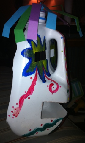
The elements of design I used are color, I used a contrasting color scheme, line, the lines on the nose and at the bottom of the mask create movement. I also used strips of paper at the top to create texture to the mask and also serves as hair.
I'm quite happy with how my mask turned out. Using a gallon milk jug helped me to create the three dimensional quality for this mask. I found the process of research to be the hardest part of this process but also helpful. Had I not come across the picture of the milk jug I would have had a much harder time creating a three dimensional mask. I can't wait to see what my classmates did for their own masks.
Mod 10 Videos Blog
I chose these two videos as my selections:
African Art: A Legacy of Oppression
The Great Wave
1. Explain why you selected each of the TWO videos you choose from the selection listed above.
I selected the African Art: A legacy of Oppression because the title intrigued me as well as the description of the video. I chose The Great Wave because I have admired this painting and was interested in learning more about its background
2. For each video list/discuss the key concepts you learned.
A key concept I learned from the African Art video was that much of the art we see as western art has roots in African Art, in particular the minimalist abstract. Another key concept was how terribly the African people were treated and then even displayed as art to "enrich" the western society about the African people and lands.
A key concept I learned from The Great Wave video was the making of a print. I didn't realize that you needed to make a separate woodblock relief for each color that will be in the print. I found this portion of the video most informative. What a tedious process this is.
3. How do the videos relate to the readings in the text?
The African art video relates to the African art section of the text in chapter 18 and helped me to understand the ideals behind their art.
The Great Wave video related to the previous chapter on prints and in chapter 19's description of Japanese art.
4. What is your opinion of the films? How do they add depth to understanding of the readings and art concepts?
I felt the African video was done very well, full of information and was only 21 minutes long. This video helped me to gain a better knowledge as to how the art came to the western world, as horrifying as it is to think about.
The Great Wave was an interesting video and helped me to better grasp the concepts of prints and editions of prints.
Mod 9 Videos Blog
For this week's module I chose the below videos:
Leonardo da Vinci: The Mind of the Renaissance
Velazquez
1. Explain why you selected each of the TWO videos you choose from the selection listed above.
I selected these two videos based on the descriptions of the videos on the link and because I was interested in learning more about Leonardo da Vinci. I chose the video about Velazquez because I was unfamiliar with his work.
2. For each video list/discuss the key concepts you learned.
The key concept I learned from the Leonardo da Vinci was just how vast his talents were. Not only as an artist but as a scientist, an architect, and engineer. He was an innovator almost from childbirth. As a young child he was always trying to learn more and even started inventing new ways to do everyday activities like reading. He became so talented that his mentor Veraccio stopped creating art after seeing da Vinci develop.
The key concept I learned from the Velazquez video was how he was able to balance the humanity of the figures while still depicting them as a "jester" or a character. He did this skillfully through his use of color, the use of subtle and bold together and also in the way in which he painted their faces as distorted and lacking light suggesting that they were dim witted.
2. How do the videos relate to the readings in the text?
Both videos expand the knowledge of each artist. The text does talk about and showcase each of these two artists but the videos give you a more detailed understanding of each artists life.
3. What is your opinion of the films? How do they add depth to understanding of the readings and art concepts?
I found both films interesting, particularly the video on da Vinci; I found his life fascinating. The description of his use of hatching gave me a better understanding of that art concept, it was helpful to see the drawing as the description was explained. In the Velazquez video I found the description on his use of simple coloring as opposed to rich and vibrant colors to get his point across helpful in better understanding of the use of colors.
Wednesday, July 17, 2013
Art Making/Material Exploration: Exploring Line
This week we have been asked to create a drawing of our hands using our dominant and non dominant hands. My dominant hand is my right hand, my drawing of the left hand was used with my right hand. The drawing of my right hand was drawn using my left hand. Here is how it turned out. 
I found it easier than I had anticipated to use hands as subject for my drawing. I am still very nervous about drawing, it seems to be a hurdle I will never overcome. I worked myself up so much that as I began my right hand was shaking. As my hand drawing developed I was able to relax and go with it. I used graphite pencils to create my drawing. I used pencils because that's all I have and its what I'm most familiar with. I have never used charcoal. It was very unusual to create a drawing with my non-dominant left hand. My left hand was shaking a lot and I found it very hard to create straight lines. The drawing of my right hand is much skinnier than my left hand. It also has much less detail. It was difficult to create detail using my left hand. I do feel though that both hands ended up as successful examples of hands. I do think I will use my left hand more often when I'm drawing, I would be interested to see if I could develop the skill of drawing with left hand.
Wednesday, July 10, 2013
Mod 8 Video Blog
This week I watched:
More Human than Human
Cataclysm: The Black Death Visits Tuscany
1. Explain why you selected each of the two videos you choose from the selection listed above.
We were asked to watch More Human than Human and then to pick one additional video. I chose Cataclysm: The Black Death Visits Tuscany because it seemed to be the most interesting based on the descriptions of the videos.
2. For each video list/discuss the key concepts you learned.
In More Human than Human, the key concepts are learned were to expand the discussion on the baby Herring gulls and their reaction to the stick with a line(s) drawn on them, this was previously discussed by the same scientist in a previous video we had watched this semester. I also found the concept of culture effecting the depictions of the human body in the art world. In early times certain elements of the human female figure was grossly exaggerated, while other body parts were completely downplayed. Then as society and culture changed so did the depictions of the human form, to those of the Egyptians, which were all very similar and all had the same scale. Once again as the culture changed so too did the human depictions in sculpture, to once again exaggerating the parts they wanted to emphasize to showcase their strength as the Greek statues did.
In Cataclysm, the key concepts I took were the profound effect the Bubonic Plaque had on the cities of Sienna and Florence in Italy. Not only did it have a huge death toll but it also effected pretty much every level of life in the region. The plaque spared no one, rich, poor, clergy, sinner. This caused the virtual stoppage of life as they knew it. Life was now filled with pain, suffering and riches were lost. Another key concept I took was the cyclic nature of development throughout the centuries. While many historians originally stated that the decline of the arts and development in the second half of the 14th century was due to the plaque, now it is more likely that this was simply due to the cyclical nature of development and then lulls in development and innovation. This can be documented on many centuries throughout history. The century usually begins with a high level of innovation, new developments. The second half of the century tends to lag behind and not many new developments come to fruition.
2. How do the videos relate to the readings in the text?
More Human than Human expands on the Paleolithic era art, describing in more detail the Venus of Willendorf. The Cataclysm video expands our knowledge of the Italian artists of the 14th century and their innovations to painting. Duccio and Giotto had a great impact on the beginning of the Renaissance period.
3. What is your opinion of the films? How do they add depth to understanding of the readings and art concepts?
I enjoyed both videos and felt they were both excellent in helping my knowledge of the chapters of text that this accompanied. The information was presented well and held my interest throughout both videos.
Thursday, July 4, 2013
Architecture Videos Blog
This week we have been asked to blog about two of the architecture videos. The videos I have chosen are:
Prairie Style (Frank Lloyd Wright)
Architecture: The Science of Design
1. For each video list/discuss the key concepts you learned.
Prairie Style (Frank Lloyd Wright)
Architecture: The Science of Design
1. For each video list/discuss the key concepts you learned.
The key concept I learned from the video on Frank Lloyd Wright’s
Prairie Style was how he helped to revolutionize the use of an open floor
plan. He wanted to create a space that
was open and flowed from one space to the next instead of being segmented into
individual rooms. He also made the most
of the nature surrounding the home as well; he wanted the home to be a part of
the land it was on rather than just a building on top of it. Another key concept I took from this video
was seeing the influence Wright has had on architects and homes that are built
today. That was especially notable in the
Dan White home in Vancouver. In this
house it has many modern elements but still stays true to the Frank Lloyd Wright
Prairie Style.
In Architecture: The Science of Design video, the key
concept I took was just how much the wind velocity affects the design of a
skyscraper. I had no idea it could cause
a skyscraper to sway that much and that the wind adds to the weight of the
building and needs to be considered when designing the building. Another interesting aspect of the video was
the idea of the smart home. This is
something that is now commonplace and affordable but when this video was made
in 1990 was just beginning to come to life and to be used by homeowners. It was interesting to see the initial
concepts behind what is used today.
Today you can achieve most of the things that happen in the video all by
using a much smaller panel, that is easy to use and program.
2. How do the videos relate to the readings in the text?
The Prairie Style video relates to the section in Ch. 13
pages 305 and 305 of the text on Frank Lloyd Wright, the video helped me to
gain a better understanding of the great impact he has had on architecture. The
Science of Design video related to the Steel-Frame Construction text on pages 299-301
and the Reinforced Concrete section on pages 303-304. This video helped me to see exactly how much
goes into creating these types of structures.
3. What is your opinion of the films? How do they add depth
to understanding of Architecture?
I felt that the Prairie Style video did an excellent job of
not only explaining Frank Lloyd Wright’s style but it also helped me to
understand the impact that he had on architecture as a whole. Being able to visualize the comparison of his
work to work of modern architects helps to fully understand the impact he
had.
I found this video informative but dated. Technology changes so fast, that video that’s
as old as this one, is now outdated. It
added to my depth of understanding architecture by explaining the key concepts
in building and designing a skyscraper and also to help me better understand
concrete and how it’s used so widely in the field of architecture.
4. Why did you choose the films that you watched?
I chose Prairie Style because of Frank Lloyd Wright, I have
toured the Darwin Martin house here a few times and have always been intrigued
by his work, this video helped to expand my knowledge.
To be honest, I chose this video because it was under a half
an hour. While I have enjoyed the videos
we have been asked to watch this semester, they do require a lot of time to be
able to watch them and then write up your post.
Saturday, June 29, 2013
Mod 6 Videos Blog Review
This week we have been asked to watch the following videos and answer the questions below:
Through the Eyes of a Sculptor
Glass and Ceramics
Installation Art
1. For each video list/discuss the key concepts you learned.
Video #1: Through
the Eyes of the Sculptor
The concepts I
learned from this video were the many steps it takes to create a large
sculpture. The video documents the
master sculptor Emmanuel Fillion while he creates a statue he has named Genesis. To see the piece go from initial concept
sketch, to clay models, to castings and then to the final piece was
incredible. I also found the process by
which the limestone and marble are harvested from the quarries to be helpful in
my understanding of the material used.
What a massive undertaking it was before modern machinery was
available. To have to use a system of
pulleys, cables and carefully moving them down a mountain by using and continually
moving wooden blocks for the marble to slide down on. It’s easy to see how someone could have been
killed during this process. Another
concept I gained a better understanding of was the use of a team of sculptors
to create a piece, each specializing in a particular area. I liked the comparison used in the video to
an orchestra; each person holds a unique and important role in the final
presentation.
Video #2: Glass and
Ceramics
The main concept I
took from this was the process of creating the glass and the ceramic
pieces. It’s fascinating to me that the
glass production seems to be very similar to how it was initially achieved; the
glassblower has to use a very delicate process to create the finished
piece. He must carefully roll and then
blow into the piece and all before it starts to cool, so that the optimal shape
is achieved. In ceramics on the other
hand, appears to be easily made on a production line. The use of modern technology has assisted in
the mass production of these pieces. Another key concept was the way glass is
used in architecture. Glass is used as a
material that adds an artistic quality to a structure all while being completely
functional and able to sustain even the largest skyscrapers.
Video #3: Installation
Art
The key concept that
this video helped me to visualize was the actual installation of an
Installation Art exhibit, I enjoyed watching the artist Martin Boyce assemble
his installation and seeing just how much work goes into those final few days
before the exhibit is open to the public.
Another concept the video helped me to grasp was just what installation
art is. I feel it was best defined by
artist Susan Hiller who said “Installation Art is the relationship between the
images, the space and the viewer that make the meaning”
2. How do the videos relate to the readings in the text?
This sculptor video
helped me gain a better knowledge of the process itself and the idea of modeling
to create the final sculpture. The glass
and ceramic video helped me to better understand the text, in particular the
section on casting. Seeing how the molds
are created and then used enhanced what I had read in chapter 11. The Installation Art video expanded on the concepts
of video in installation art. It helps
to see this technique used rather than just reading about it in a text book.
3. What is your opinion of the films? How do they add depth to understanding of the topics: Sculpture, Installation, and Craft?
I enjoyed Through the Eyes of the Sculptor and Installation Art videos. I found them both to be very informative and helpful in expanding what I had read in the text. They both showcased an artist creating art, to me that is a huge help in completing my learning of key concepts we have gone over in the text. The Ceramics and Glass video I didn’t enjoy, it seemed dated and didn’t really help me in furthering my understanding of the concepts that were gone over in the text.
Peer Review Blog
1. Hyperlink the Blogs you reviewed into your Blog
http://coopaedblog.blogspot.com/ by Logan Cooperberg
http://gracesplanetworld.blogspot.com/ by Grace Platt
2. When looking at Project #1: (Elements and Principles), did you agree with the element or principle the artist listed with the images? Did you see other elements and principles in the images?
I agree with the photos that both Logan and Grace chose for each element and principle. My favorite picture in Logan's was his movement shot, I know I struggled with movement, I think I appreciated his excellent shot of water coming out of a faucet even more. The picture I liked the best in Grace's blog was her form photo, it shows an old possibly abandoned home and a beautiful Japanese Maple tree. Many of the pictures shown in each slide show also have other elements or principles, for example I feel that Logan's color picture also shows contrast. Grace's shape picture also shows texture.
3. When looking at Project #2: Where there any images in the Peer Blogs the same as your own? If yes, what were they? Where the reasons the image was selected the same or different as your own?
None of the images selected in their art gallery visits were the same as my own, Logan went to the Manhattan Museum of Art in Manhattan, so obviously there wouldn't be the same pieces used. I did enjoy reading the reasons that each person selected each piece. Made me feel a connection with them, that's so hard to get when taking an online course.
4. Where there any images that your Peers selected that pique your interest now? If yes, what are they and what is your connection with them? What would you want to know about them?
A piece that Logan selected that piqued my interest was the Rene Magritte, The Eternally Obvious, 1948, its a painting of a woman but its broken up into individually framed sections. I feel that the artist was showcasing that women are often reduced to only our parts, not taken seriously as a whole person.
A piece that Grace selected that most interested me was Untitled piece by Tauba Auerbach. I unfortunately missed this piece during my Albright-Knox visit, its a painting that is made to look like crumpled paper. That completely fascinates me. How in the world is that even possible. Just amazing!!
5. What do you think about the process of reading your peers reflection? Do you find this to be a valuable in your learning?
Reading the reflection was critical to understanding what Logan and Grace were both thinking and feeling at the time. This helped me gain a better appreciation for the work they did.
6. Check your Blog and read comments posted by your Peers. Do you find their comments helpful?
I really enjoyed this assignment and most of all reading the comments by Wasim and Carl. They both left me positive feedback, which is always wonderful to hear. I spent so much time, especially on the photo project, that its nice to see that other people enjoyed it as well. I find this very valuable in my art knowledge, while a good grade is great, hearing one of your peers enjoyed your work, is just as important.
Sunday, June 23, 2013
My visit to the Albright-Knox Art Gallery


In this blog post I'm going to share with you six pieces that made the biggest impact on me during my visit to the Albright-Knox Art Gallery. I'm ashamed to admit this but I haven't been to the Albright-Knox in well over ten years. While I remember some of the pieces, most of the pieces on display were new to me. This is a great time to get to the gallery, they are currently featuring Pop Art with the Sweet Dreams, Baby Life of Pop, London to Warhol. To see such iconic pieces up close and personal was well worth the price of admission. I loved the exhibit.
Which artworks made an impact or impression on me? Why?
One piece that made an immediate impression on me, albeit a negative one, was this piece by Claes Oldenburg, Untitled (Cigarette Butts), 1968, Varnished cigarette butts mounted on wood.

My initial response was this "Um what?? Dirty cigarette butts varnished to a piece of wood? Art?" Being at such a beautiful gallery amongst amazing pieces of art is basically discarded trash. This piece just didn't sit well with me at all. I felt almost offended by this piece. I just kept looking at it thinking, okay what am I missing? I would walk away and come back and still was just not getting it. I mean if its a dig on smoking and the bad effects it can have on your health but I really don't think that's what this artist intended. As I continued on, I kept flashing back to this piece and laughing to myself. What a joke.
Another piece that had the biggest impact on me was Andy Warhol's Jacqueline Kennedy III from the portfolio "11 Pop Artists, Volume III," 1965, Screen Print From an edition of 200

Here Warhol took photographs taken of Jackie Kennedy before and after her husband President John F Kennedy was assassinated and displayed them together. The images are haunting. The images portray different emotions the first lady was going through. The feelings of happiness, shock, numbness and grief-ridden. Warhol has done a beautiful job of freezing this moment for us all, while I wasn't alive when this terrible tragedy occurred, seeing a piece like this brings it to life for me and makes me feel, even if only a fraction of what it must have been like for the nation and most importantly for this family to have someone so young and full of life taken away in an instant.
Which artworks do I feel a connection with? Why?
I felt an immediate connection with Georges Seurat's Study for Le Chahut, 1889, Oil on canvas.

Another piece I felt a connection with was Roy Lichtenstein's Picture and Pitcher, 1977, cast executed 1978, Painted bronze.

Which artworks would I like to know more about? Why?
One piece I would like to know more about would have to be the enormous piece on display by Jackson Pollack, Convergence, 1952, Oil on canvas

The piece is almost the entire wall, so of course I immediately wondered, just how do they transport and get pieces of this size to and from galleries? Another thing I've often wondered about Pollock's work is just what is it he wants us to feel and think? Convergence of what exactly? Life, people, societies or simply the colors of his painting coming together to create a unified piece?
Another piece that left me curious was John Armleder's Untitled piece, 1980-98, Acrylic and pencil on canvas and acrylic on wall.

Did the artist originally envision this to be this large a piece or was it originally a much smaller piece that he created on one single canvas? The scale of this piece is massive, inhabiting an entire wall. The artist has drawn circles of varying colors and sizes, the largest circles are drawn directly onto the wall while the smaller ones are drawn on canvas and placed equidistant from each other on the wall to create one massive piece. Another thing I wondered was did the artist intend the reflection of his piece onto the marble floor to be a continuation of the piece? The reflection onto the floor adds to the overall piece in my opinion.
Subscribe to:
Comments (Atom)